De-Mystifying Abstract Paintings
/
Last week in my gallery at the First Friday Gallery Hop a young fellow said to me: "I just don't GET abstract paintings." At the time I wasn't sure how to respond to the comment. After some thought on the subject I decided to illustrate parallels between my more representational work and my abstract work in hopes it will provide some understanding for those who may not GET abstract painting.
Ten years or so ago I began studying abstract work, and soon found my work shifting from more representational to less representational. I found myself more concerned with defining shapes and simplifying value patterns than anything else.
I then began to realize that abstract paintings can have the same underlying structure as more representational work. No matter the "style" or "ism" of the work, the pieces should display the development of a center of interest (or multiple centers of interest), a way for the eye to move through the work, development of shapes and values (value is the lightness or darkness of a shape), and the implementation of color theory. The examples below illustrate, in black and white value for, the shapes, values, and placement of centers of interest.

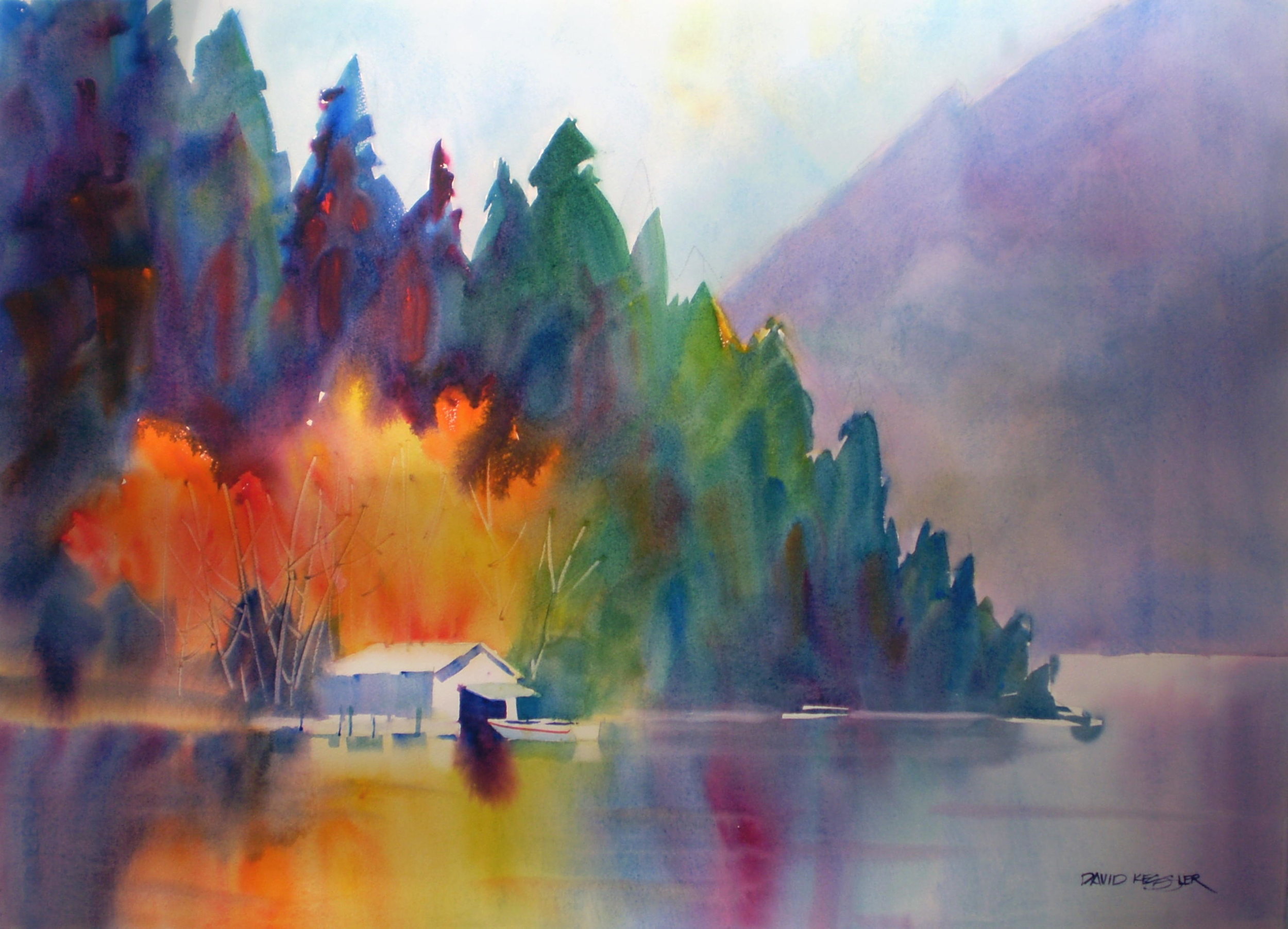
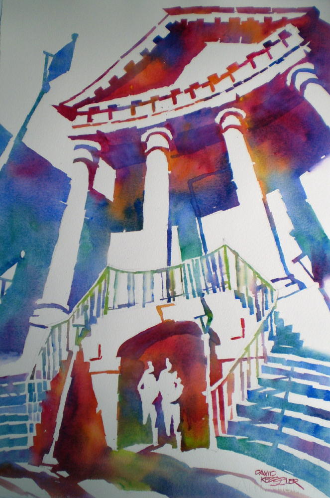
This painting is divided by the rule of thirds. The intersection of each grid line is roughly the location that a center of interest should occur. Nearly all of the intersections have something interesting to stop the eye, but both top and bottom intersections on the right side provide the main centers of interest with the highest value contrast and the brightest colors. The design of the shapes, lines and planes keeps your eye moving through the work, all the while directing movement toward the main centers of interest.
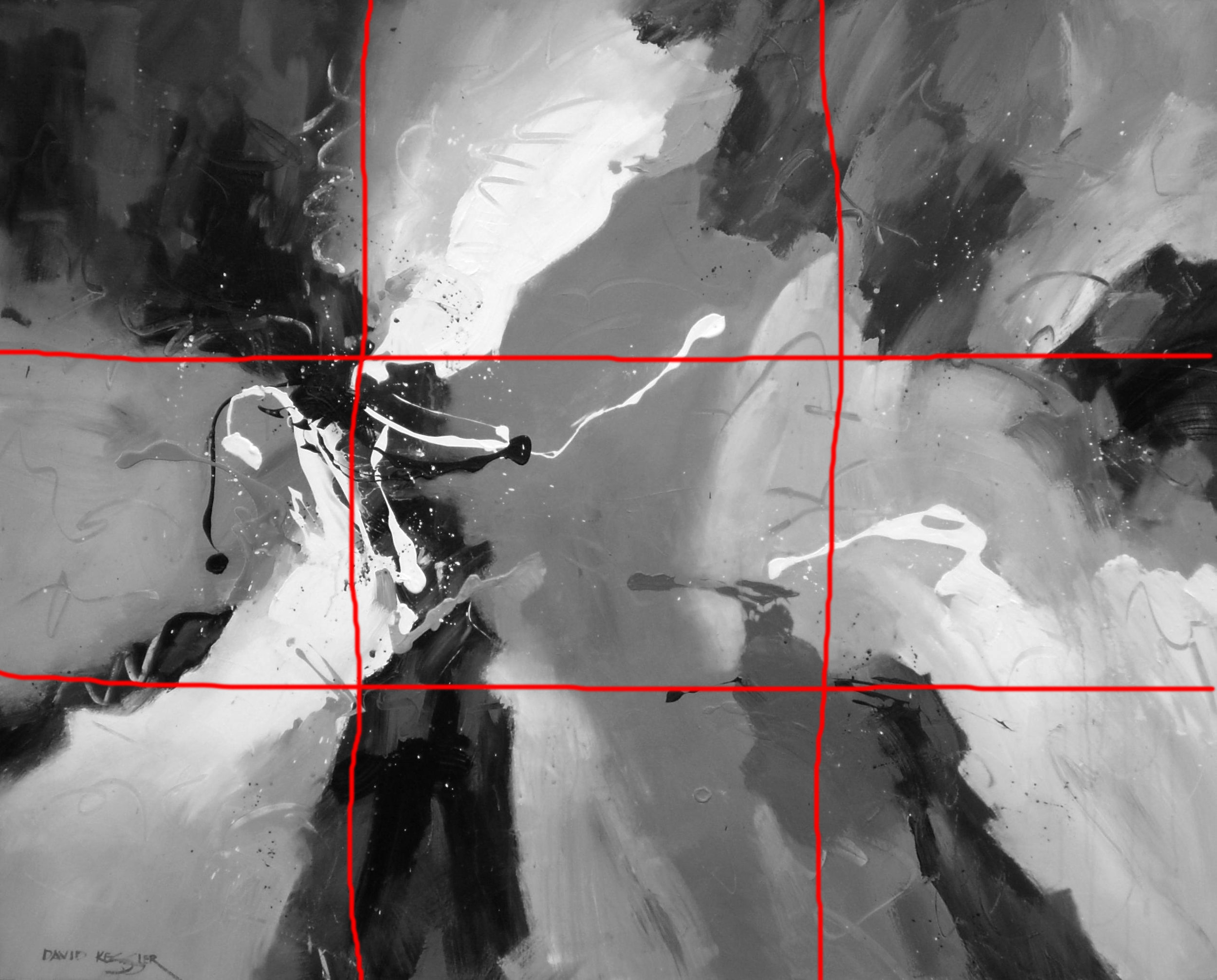
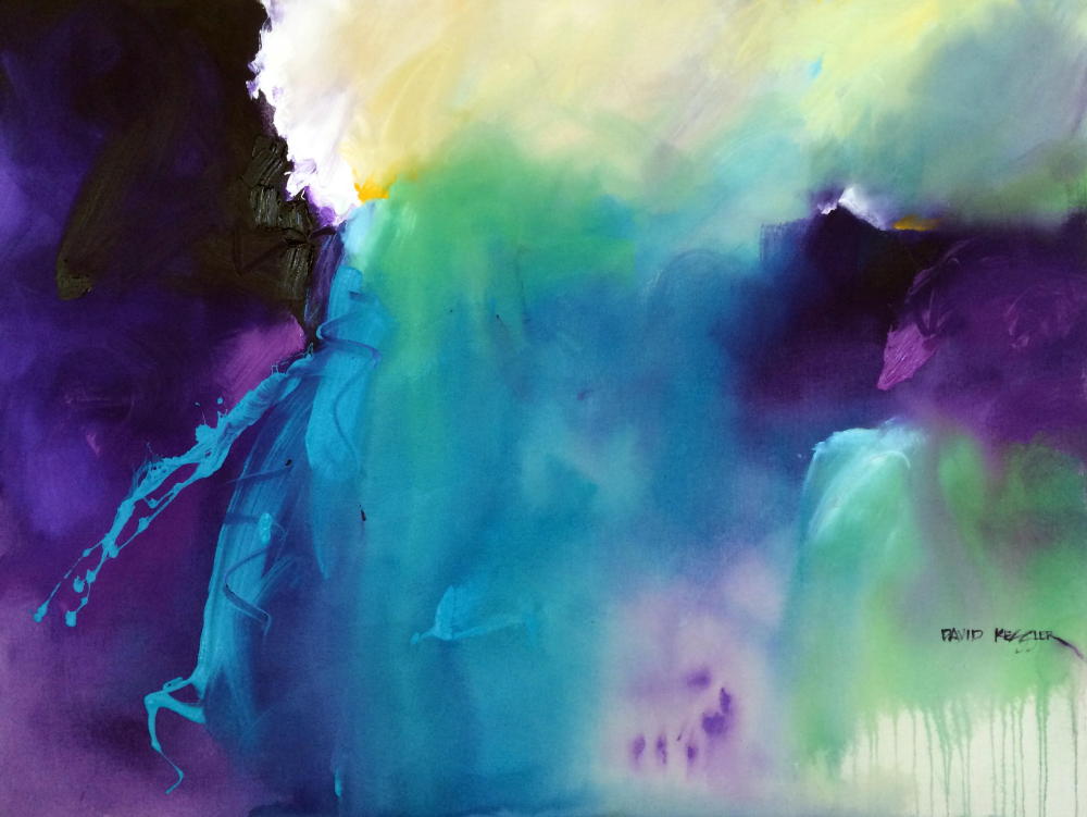
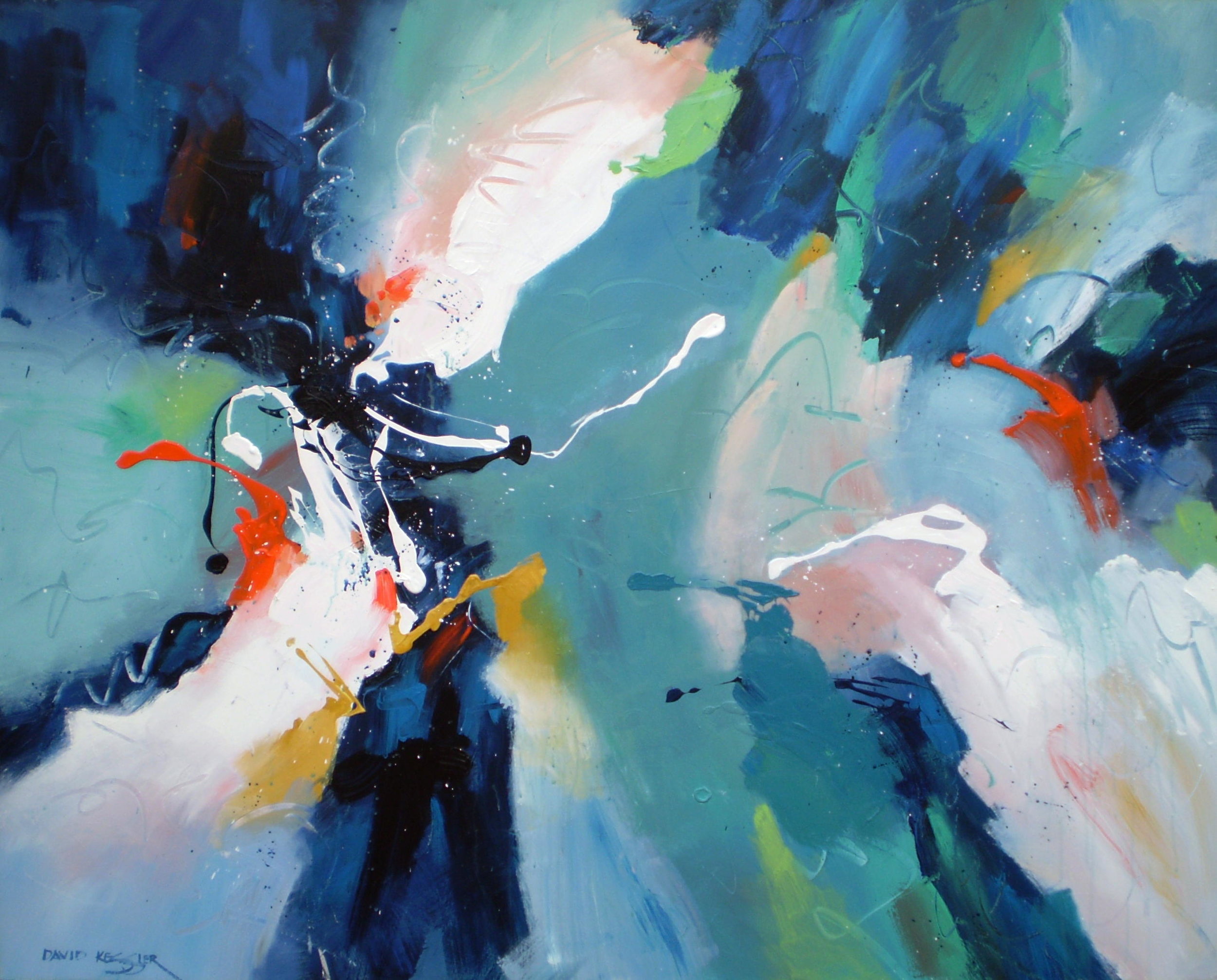
When we apply the rule of thirds to an abstract work we see the same development of centers of interest at the intersections of the grid lines. There are value contrasts at each with the shapes directing the eye to those areas. The highest value contrasts, thus the primary centers of interest, occur on the left side.
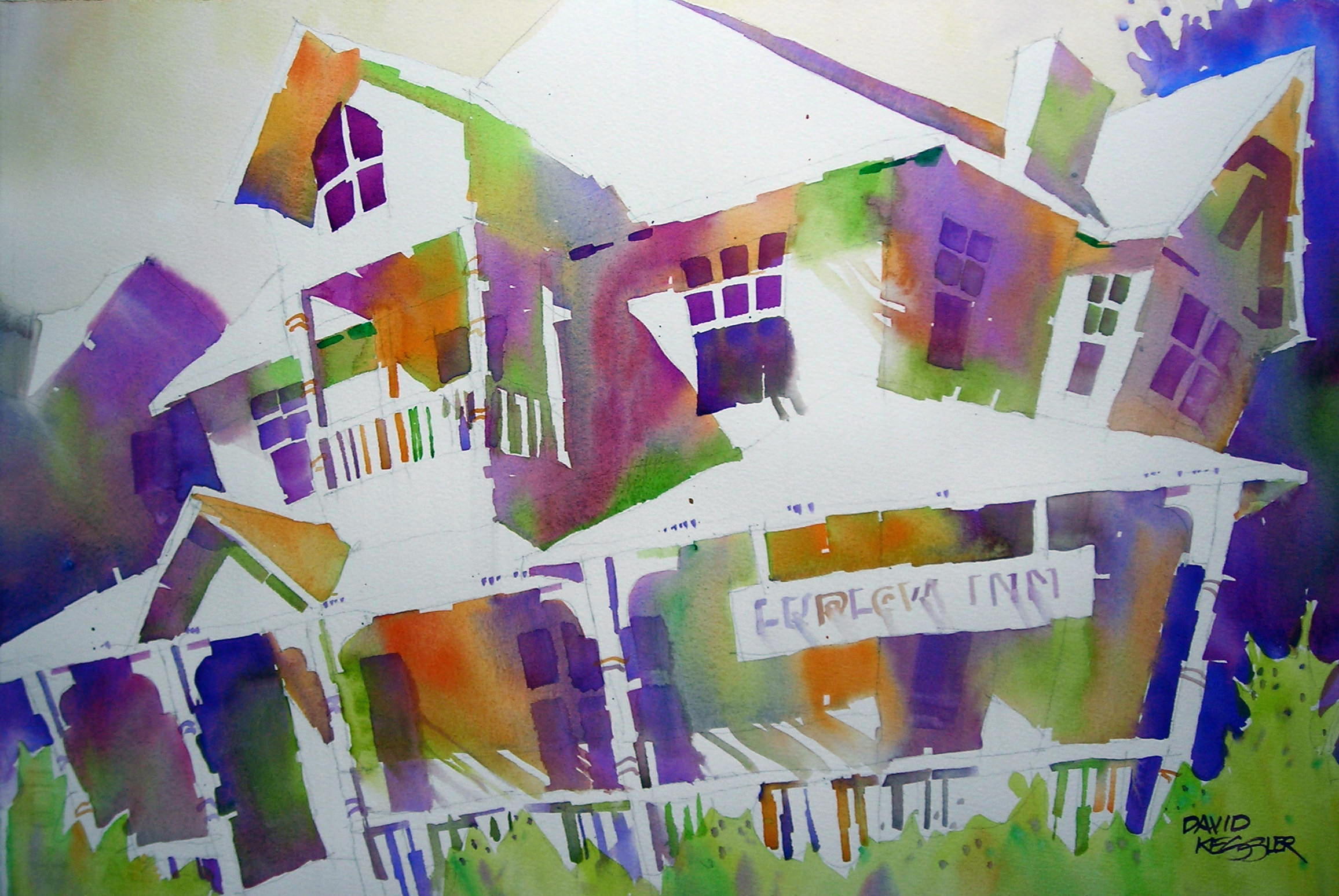
In both of these works we can observe a nice assortment of shape sizes. The values tend to be about 75-80% mid-value and 20-25% light and dark value.
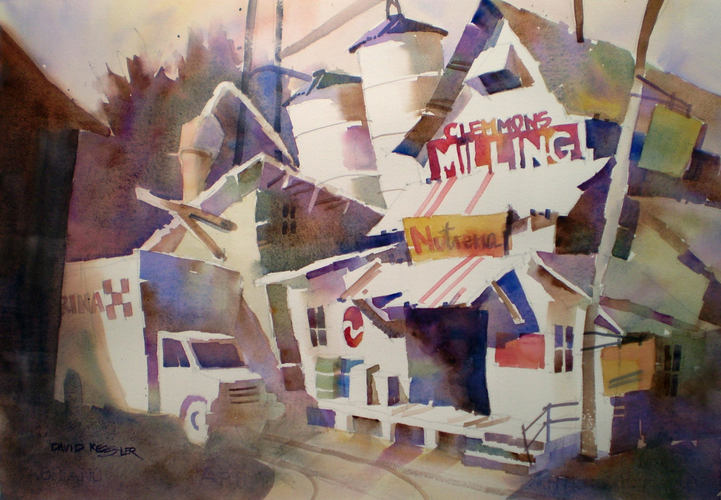
You can see both my representational work and my abstract work have the same underlying structural concepts utilizing the design elements of line, shape, value, color and texture for the development of the work. The biggest difference in the finished products is that one provides a more traditional frame of reference for "known objects" and the other lets the mind develop its own frame of reference.
I hope this helps to de-mystify abstract paintings for you!
If you are interested in learning to paint more expressively through abstract painting, you can paint with me here or join one of my online courses.
