IUCN Red List category: Least Concern
Distribution: Common and Localised
Records of occurrence for Pronolagus rupestris (n=9)
Model outputs
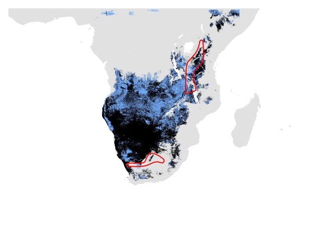
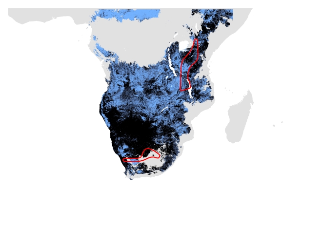
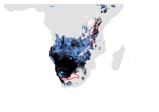
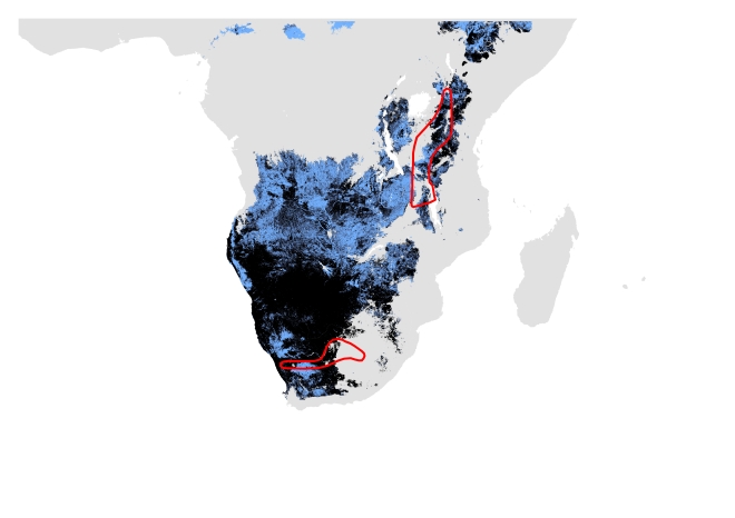
Here we are NOT aiming to model the actual observed range of the species, but the extent of the potentially suitable bioclimatic envelope. This will inevitably be larger than the actual range as it is not restricted by landcover or anthropogenic impacts etc. However, the potentially suitable bioclimatic envelopes have now been clipped so that unsuitable habitat (based on land cover classes) is omitted. The areas in black represent suitable climate and habitat and the areas in blue represent only suitable climate.
Your expert opinion is extremely useful in evaluating these models and will lead to us assessing Maxent as a platform for species distribution modelling. We ask that you provide your expert opinion of the models, rather than an evaluation of our success at modelling the species; a negative evaluation is just as informative as a positive one.
Please click on the images to view in a new tab.

A. Current distribution using only modern data. Potentially suitable climate and habitat shown in black (Range size = 3,634,530 sq.km) and potentially suitable climate shown in blue (Range size= 5,839,508 sq.km). IUCN polygon shown in red.

B. Current distribution using modern and past data. Potentially suitable climate and habitat shown in black (Range size = 5,344,632 sq.km) and potentially suitable climate shown in blue (Range size= 9,381,438 sq.km). IUCN polygon shown in red.

C. Past distribution using only modern data. Potentially suitable climate and habitat shown in black (Range size = 3,503,479 sq.km) and potentially suitable climate shown in blue (Range size= 5,571,806 sq.km). IUCN polygon shown in red.

D. Past distribution using modern and past data. Potentially suitable climate and habitat shown in black (Range size = 3,891,475 sq.km) and potentially suitable climate shown in blue (Range size= 6,286,744 sq.km). IUCN polygon shown in red.

